The modern business landscape is more complex than ever, so B2B marketers must get more sophisticated in their approach to lead generation. No longer can they rely on a single touch point, such as a trade show or print ad, to reach their target audience. They need a comprehensive, multi-channel approach that includes a mix of inbound and outbound tactics. The landing page is one of the most critical elements of a successful B2B lead gen campaign. A well-designed B2B landing page can help you capture more leads and convert more prospects into customers.
Landing pages are often used to promote websites and products online to convert visitors into leads or customers. A lead is someone who has shown or expressed interest in your business by filling out a form or downloading a file. Landing pages are different from regular web pages because they are laser-focused to attract users and keep them engaged until they take action.
Landing pages are generally used for B2C marketing, and they are optimized for sales conversion. On the other hand, B2B landing pages are optimized for lead generation and project authority. B2B landing pages often require much attention to detail. Because the purpose is to target businesses, and the landing page needs to provide information that helps businesses decide whether or not they want to do business with you.
Here are some best practices for creating effective landing pages for B2B marketing:
Focus On The Customer
Your landing page should focus on the customer and nothing else. Simply put, your audience determines the language and tone you should use on your landing page. Your goal is to create a compelling message that will convince potential buyers to take action. To achieve this objective, start by understanding your target audience.
What problems are they trying to solve?
Why are they interested in your product or service?

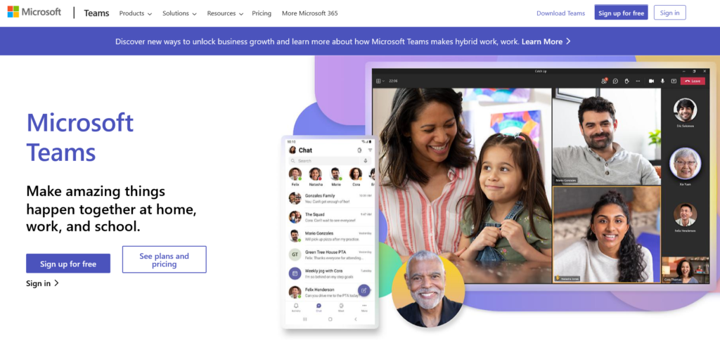
Check the microsoft teams landing page example. The landing page is for their group chat software, they have clearly stated who are their customers in sub-headline, including appropriate call-to-action buttons.
Next, write a persuasive sales pitch that addresses their issues. Use language that resonates with your ideal buyer. For example, B2C companies should focus on customer service and friendly language. Meanwhile, B2B companies should emphasize professionalism and authority.
Use Visuals And Graphics
Visuals and graphics play an important role in landing page design because they increase engagement and conversion rates. People respond positively to images and videos. Adding photos, videos, infographics, and charts can help draw readers’ eyes to certain parts of your website and increase its effectiveness. In fact, studies show that visual elements increase conversion rates by up to 300%.
For example, you might include a chart showing the benefits of your product over competitors, or you could post pictures of happy customers on your landing page.
Include relevant visuals that demonstrate why your product or service is worth pursuing. And make sure your button stands out against the rest of the page.
Keep Content Simple
While you want to keep your landing page simple, you also want to avoid being too simplistic. Visitors typically scan landing pages quickly, and too much text can overwhelm readers. Instead, use bullet points and short paragraphs. Bullet points are easy to scan and digest. They’re also a quick way to summarize complex topics into short sentences.

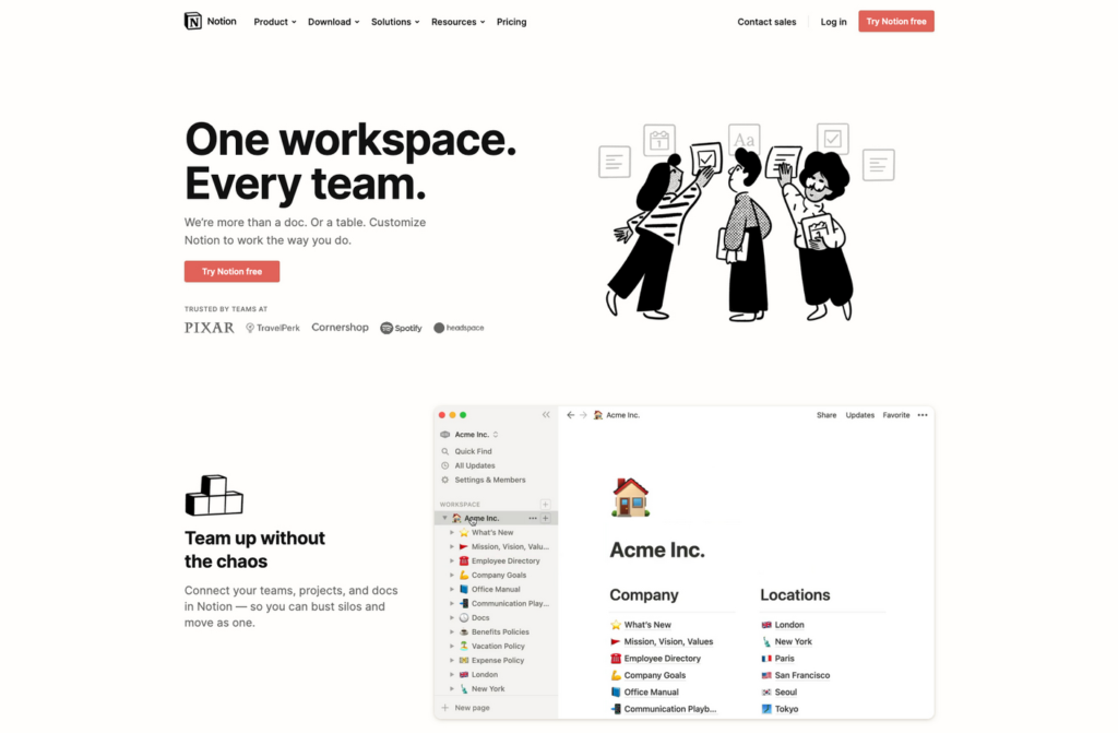
You can see how Notion nailed the content to keep it simple and to the point leaving no room for ambiguity.
One of the biggest mistakes websites make is trying to cram too much content onto their landing pages. People hate being overwhelmed by too much information. Instead, keep your landing page brief and direct. Focus on telling visitors what they’ll learn on your site instead of explaining everything in detail. If the visitor doesn’t know why he or she should purchase the product, there won’t be much motivation to take action.
Write a clear copy that explains the benefits of your product or service. Avoid technical jargon and long sentences with too many fonts and colors.
Test Different Headlines
One of the most common mistakes when designing a landing page is failing to test different headlines. Headlines are often overlooked. Yet, they can dramatically impact conversions. Your headline should grab readers’ attention and entice them to read further. And since the headline is usually only one line long, it has a lot of power over whether or not readers decide to read further.
For example, suppose you run a website selling custom-printed t-shirts. You could try writing a headline like, “Get a Custom Printed Shirt Today.” Or, you could write, “Customized Shirts Are Easy To Order.”
Which headline sounds more appealing?
Which one gets clicked?
The key is to Focus On Benefits – People are more likely to read a headline that talks about benefits rather than drawbacks.

See the mailchimp’s landing page example. The headline captures what the ‘potential customers’ are going to get using their service.
More examples:
If you were selling a product, you might write “Great Product With No Side Effects.”
Or, if you were offering a service, you might write ‘No Hassle Service Guaranteed.’
Give Readers Something To Think About – Be creative!
People prefer clickable headlines over non-clickable ones. As a result, you should test different headlines until you find one that converts.
Remember, the best headlines are unique and stand out from the crowd.
Don’t Forget Social Proof
Social proof refers to the idea that people trust others more than they trust themselves.
The reason behind this phenomenon is simple — people tend to act according to what they believe is standard practice.
In order to increase conversions, you should incorporate social proof into your landing page design. For instance, if you sell software products, you could display testimonials from satisfied customers. Or, if you’re selling books, you could feature reviews written by previous buyers.

As you can see in above example, copy.ai has used testimonials on their landing page to built trust. It works very well in improving conversion rate.
Some more examples:
If you sell software, post screenshots showing happy users.
If you sell clothing, share pictures of happy customers wearing your shirts.
If you sell furniture, post reviews written by satisfied customers.
Use CTAs
The best landing pages contain clear calls to action that entice users to take action. Calls to action are buttons or links that prompt site visitors to click on them. Calls to action are often used to drive traffic to websites, social media profiles, email lists, and blogs.
Your calls to action should be simple, concise, and relevant, it should tell visitors exactly what they’ll get if they click through. Don’t overload visitors with too many options. Instead, focus on one primary call to action.
For example, if you sell shoes online, an appropriate CTA is that reads “Buy Shoes Online” instead of “Order” Or, if you run a blog, you could add a button that says “Subscribe Now.”

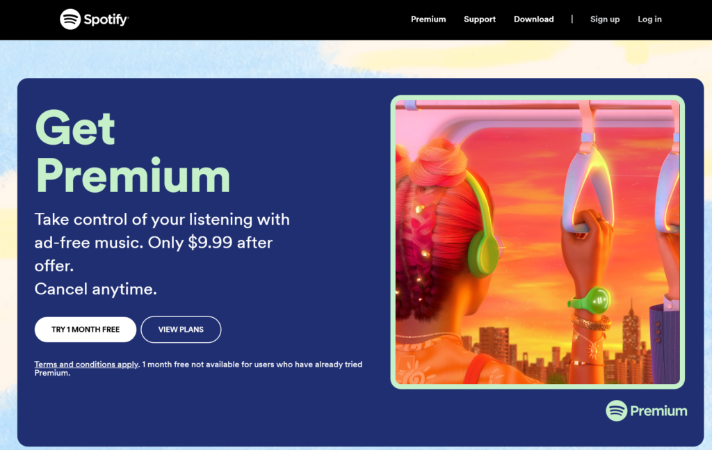
The example of Spotify CTAs are customer friendly, it is not saying to buy the service, instead it is encouraging the users to try the service for 1 month. In addition, it has included a CTA to ‘view plans’, that makes the service more transparent with respect to what users are going to pay after the trial period.
Don’t assume that your current calls to action work. Try different variations until you find the one that converts best.
Measure
After you launch, track your landing page performance over time. Look at trends such as bounce rate, average session duration, and conversions. These numbers will give you insight into how your landing page performs.
To understand why measuring landing page performance matters, we need to look at how conversion works. Conversion refers to the percentage of visitors who perform the desired action after visiting a website. For example, if a visitor lands on a landing page and clicks a button to sign up for a free product trial, he or she would be considered to have converted.
Knowing how well a landing page performs gives marketers insight into where improvements should be made. For instance, if a landing page receives very little traffic, it may indicate that the content isn’t compelling enough. On the other hand, if a landing page gets lots of traffic but too few conversions, it could mean that the site is too cluttered. In either case, the landing page needs to be improved.
Measurement also provides valuable insights into how visitors interact with a landing page. For example, marketers might want to know how long users spend reading each landing page section. Knowing this information can help them create better copywriting and design elements.
Provide Contact Information
Finally, make sure your contact information appears prominently on every page of your landing page. Contact forms are beneficial. The goal of a landing page is to get the visitor to take a specific action, such as filling out a form.
However, you don’t want to make your forms too long or complex, or you’ll risk losing the visitor’s attention. Keep your forms short and sweet, and only ask for the information that you absolutely need.
Finally, ensure your landing page is optimized for mobile and desktop devices. More and more people are using their mobile devices to access the internet, so it’s essential that your landing page is responsive and looks great on all screen sizes.
Conclusion
In conclusion, landing pages are essential for any B2B marketing strategy. They allow you to test different messages and content formats before committing to full-scale campaigns. And if you use the right tools can create multiple versions of each page, allowing you to experiment with various messaging strategies without spending too much money.
Landing pages also provide a great place to collect leads and nurture relationships with potential customers. But like everything else in digital marketing, landing pages aren’t perfect. These basic guidelines will help you create a successful landing page.
Now that you understand the best practices, you’re ready to put to work for you. Try adding a few of these ideas to your next landing page campaign. And remember, the key to success is testing and consistency. There are still many ways to improve upon their effectiveness, which is why we put together this guide. We hope you find it helpful!
Good luck!